Once you've been through the general settings, it's time to give your site some personality by updating the brand settings.
Go to Settings → Design to update your site's brand settings, including your icon, logo, cover image and accent color.
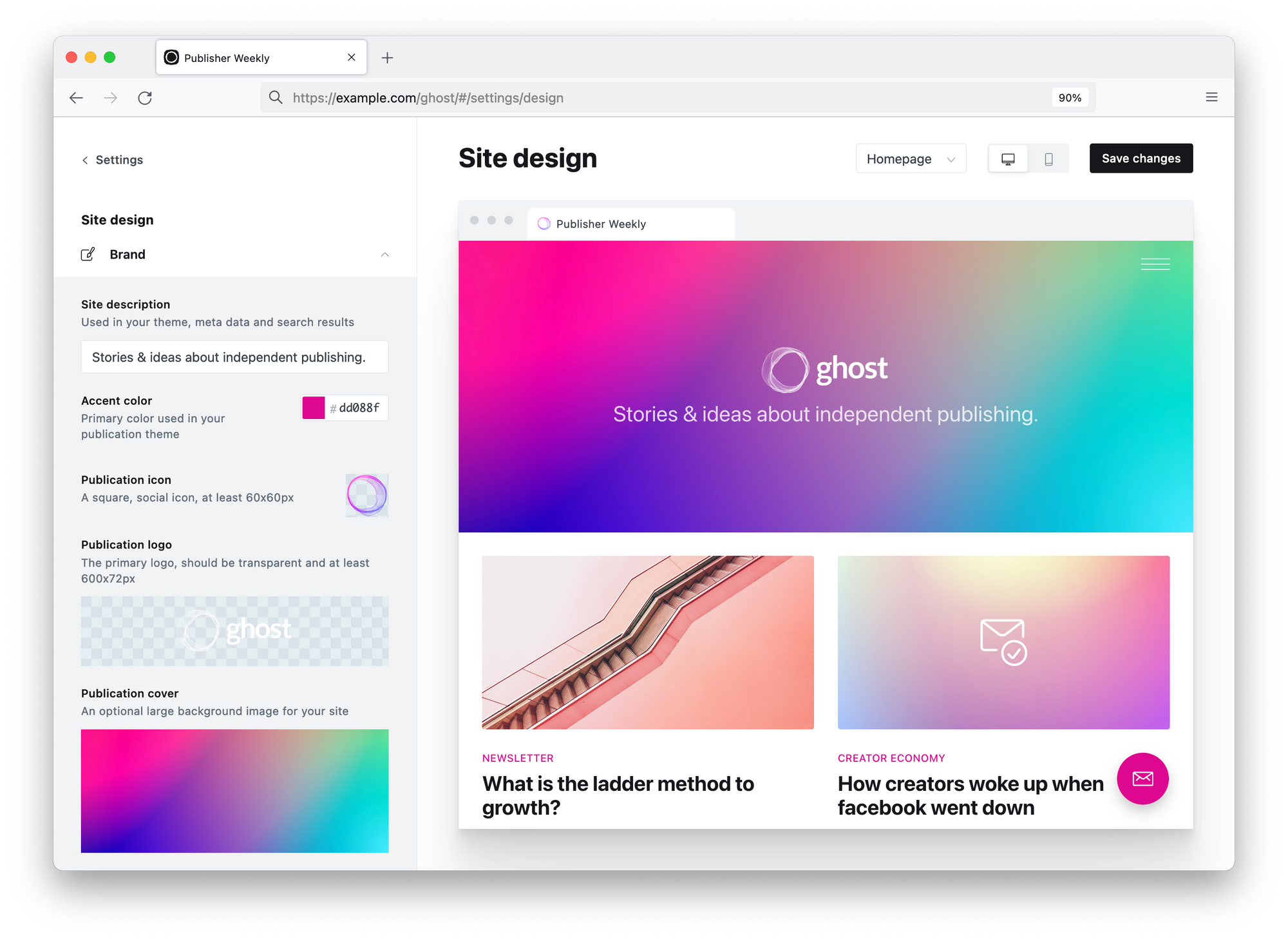
Site description
This description is used in your theme when supported, and is also used as the default description for site wide meta data.
Accent colour
The accent colour is the primary color used in your site's theme (supported themes only). This includes links, buttons, and text colours. Try to use a colour that contrasts well with your site's theme for maximum impact.
Publication icon
This is a social icon that is used as the Favicon for your site. You'll also see this in the far corner when you're logged in to your publication. Publication icons must be square and at least 60px.
Publication logo
This is the primary logo for your brand and displayed in your theme. Publication logos should have transparent backgrounds and at least 600px x 72px.
Cover image
A cover image is optional and used in some themes, which displays as a large banner image on your index pages.
It’s recommended to use images with a minimum width of 1500px to ensure your cover image looks good on most devices. Don't forget to optimise your image first to ensure it doesn't impact page speed!